Evolution of Bike Brand Identities: 5 Bike Makers Revamp Logos Over the Years

Brands originating from India, Japan, Europe, and other regions around the globe regularly modify their logos to stay current with the latest trends.
Logos play a crucial role in brand identification, as people often associate brands with logos. The significance of a logo for any brand cannot be overstated. For example, we have grown accustomed to recognizing motorcycles and cars primarily by their logos.
For leading manufacturers across various industries, altering a logo is a challenging decision to make. Nokia is a recent example of a company that opted to change its long-standing, iconic emblem.
The world of two-wheelers has also experienced similar changes. Below are the top five instances accompanied by their respective Taglines.
Royal Enfield- Made like a gun, goes like a bullet.
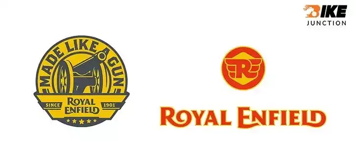
Having originated from Britain, the motorcycle manufacturer based in Chennai produced its inaugural motorbike in 1901. Before this, the company boasted a rich history of producing firearms, needles, bicycles, lawnmowers, quadricycles, and cannons.
As a result, it comes as no surprise that the company's motto, "Made Like A Gun", is still deeply embedded within its brand identity. The logo has undergone significant transformations from its inception to the present day. Nevertheless, it is currently easy to recognize.
The current Royal Enfield emblem, used since 2013, is a more contemporary take on the previous royal-style logo. The logo starts with the letters "R" and "O," further, "E" and "N," and "L" and "D" all fused.
Hero Honda- Hum Main Hai Hero
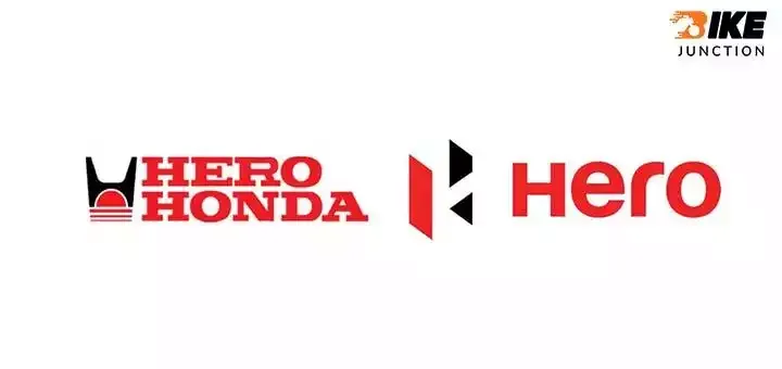
In 1984, Hero Honda was established as a collaboration between Hero Cycles and Honda. The company introduced motorcycles that became highly popular among the masses due to their reliable and easy-to-use persona. Their products were known as "fill it, shut it, forget it."
In India, affordability and fuel efficiency were the most desirable features of a two-wheeler. So after the partnership ended between the two companies in 2011, Hero adopted a new, stylish and contemporary logo that is still used today.
On the other hand, Honda has a rich history that could merit a separate article. First, however, there is another history of the evolution of the Honda logo over time.
Bajaj- The World's Favourite Indian
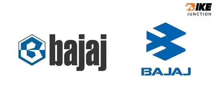
Bajaj is ranked as the world's third-largest and India's second-largest motorcycle manufacturer. Bajaj initially began by importing and selling two and three-wheelers within the country.
Despite being in existence since 1945, the company has only changed its logo once. While the previous emblem could be seen on the Chetak model, the new design has gained popularity and easy recognition through the Pulsar range.
KTM- Ready to Race
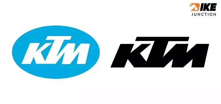
Surprisingly, the brand we now associate with the colour orange initially had a tiger in its logo. KTM acquired its first logo when it started as a car repair shop in 1953. Although their first logo was used only for a short while. KTM continued releasing updated versions until they finally settled on the current simple logo (the one we're familiar with today).
LML- Freedom Express
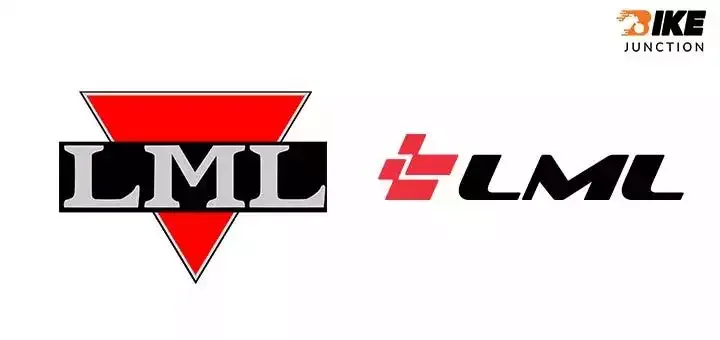
In 1972, Lohia Machines Private Limited was established as a producer of synthetic yarn. In 1984, they entered into a technical collaboration agreement with Piaggio. Further, they started working on a scooter project, which propelled LML into the limelight.
Recently, in 2022, LML reemerged by launching three electric two-wheelers and unveiling a refreshed appearance.
Check out 2023 Bajaj Chetak Here And It Offers Longer Range Per Charge.
Are you searching for a new bike? Explore bikejunction & compare your choice of bike, we will help you out with a bike loan. Select your bike according to category and other specifications on Bike Junction with just one click. Follow our news section or Social Media handles to get the latest news & updates related to the bike industry in India.
Follow us for Latest Bike Industry Updates
Facebook - https://bit.ly/BikeJunction_offl_fb
Instagram - https://bit.ly/BikeJunction_ofl_insta
Twitter - https://bit.ly/BikeJunction_ofl_twitter
Youtube - https://bit.ly/BikeJunctionYUT
Previous
Next


